Step 3: Visualize the data
The task below will be automatically checked off once you complete watching the video.
[progressally_objectives]
[progressally_media media_id='1']
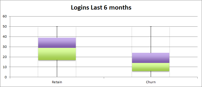
For each metric, create a box plot. The box plots show the distribution of the metric for members who churned (left) vs members who renewed. If the box plots look the same, discard the metric because it is NOT predictive. The less alike these two box plots are, the more likely it is that you’ve identified a metric that predicts a member leaving the organization.
The goal is to find two to three actionable, predictive metrics.

The coloring here is an optional illustration from Excel. Here, the green box represents the 25-50% range, and the purple box is the 50-75% range.
Additional Tools
Open or download the Predicting Member Churn Spreadsheet to see the examples of box plots by opening the metric specific tabs in the spreadsheet.
[accessally_course_navigation prev_button='Previous' next_button='Next']
[progressally_note note_id='1' allow_attachment='no']
Share your progress!
[progressally_social_share type='facebook' share_id='1' post_id='42'][/progressally_social_share][progressally_social_share type='twitter' share_id='1' post_id='42'][/progressally_social_share][progressally_social_share type='email' share_id='1' post_id='42'][/progressally_social_share]
[progressally_progress_bar post_id="6437" width="100%" height="25"]
